


If Goldfinger were actually about silver, AND it were a baseball card set instead of a movie, Leaf 1990 would absolutely be Goldfinger. Look at all that silver. Leaf was a brand (actually the parent company) of Donruss which had produced cards in the 1940 and resurfaced as the Canadian version of Donruss cards in the 1980s. I said Upper Deck changed the game in 1989, and this was the first attempt from the established companies to compete with the new, premium competitor on the block.
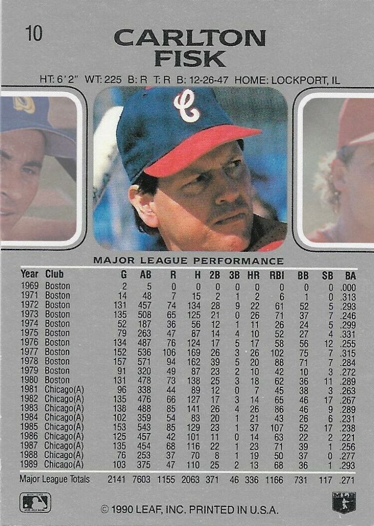
I’ve previously remarked “as a nine year old, this was a very classy card design,” but this one remains that way, nineteen years later. Skybox’s 1990-91 basketball set had a very similar design ethos (and gold ink), except they turned their dials up to 12 or even 13. Super clean printing, an understated yet unmistakable design, great card stock, full color rears (well, “mostly silver with full color headshot” rears), and it checks all the boxes. It’s not obvious in the these scans, but despite being “premium” (foil packs = fancy) and printed on white cardboard, these cards weren’t glossy, which is a good time to mention that despite Upper Deck’s 1989 and 1990 sets (also 1991, but we’re not there yet) being described as “glossy,” that was only figurative compared to the brown cardboard and dull printing of pretty much everything that came before. These mentioned cards show great, precision printing AND silver spot color ink added to the standard four color process (can’t make metallic silver with just cyan, magenta, yellow, and black — was Pantone 877C?? probably, but it’s to history and a swatch book I no longer have), but they’re not yet getting layers of gloss clear coat on top. The ONLY critique I have for the front is early-80s typeface for his name. Come on, Leaf! I won’t be quite as charitable to the back: it’s SO MUCH silver, that weird typeface shows up again for “MAJOR LEAGUE PERFORMANCE,” and the squares next to the headshot serve only as “ears” for the picture. The feature makes no sense. It implies a carousel-type layout, which would be pretty neat for a baseball card, where the headshots from the previous and next players in the set would show up in cropped form, but, hey, this is still 1990, so I’ll take what I can get.
WAIT – you want to see the carousel concept! I will answer the question about 1990 Leaf that you never knew you wanted to ask in full color AND with some transparency added to really showcase the dad scowl. To the left is card 10’s Pete O’Brien, and to the right is card 11, Joe Magrane.

I won’t go after it here, but this was technically sold as “The 1990 Leaf Set,” which is truly one of the first occurrences I can remember of adding “the” to make something sound fancy. And for completeness, I’ll point out that I’m now old enough to have witnessed the removal of “the” from things that should have it in order to, wait for it, make those things seem fancy.

Another detail that other 1990 sets hit or miss is the oft-mentioned pants numbers that were removed for the 1989 season but appear frequently in the 1990 sets. For the record, this card gets it right, with a picture from the 1989 season. This is the lie that I want; that despite a baseball card’s most relevant signifier being its year, the previous year is showcased, with stats and pictures serving as a one page yearbook for that player last year, a perpetual twelve month delay between the promises of the year in the name of the product and the cold, hard history on the cards show, both the art of the photography and data of the statistics. In other words, I am absolutely trying to make “I want the lie” happen. The always-great SABR Baseball Card Research Committee featured a post by “jasoncards” (sorry, I could only find a screen name), about the concept of trying to improve cards in bad condition. Easy example: using a paper cutter to turn rough edges into sharp edges. More complex example: cutting into edges to accomplish better centering or touching up missing ink. He used a catchy title, “Ruining with Scissors,” but what I really like is his dictum, “Condition is a one-way street.” If he helps make “I want the lie” happen, I’ll push “Condition is a one-way street” until I’m blue in the face.
For anyone looking for a bit more clarity, he’s positing that card condition can only decrease from the ideal pristine of the pack (or factory box), regardless effort spent to improve it. In fact, the improvement itself actually further decreases the condition of the card. In a way, this is quite similar to entropy and the second law of thermodynamics. Kind of.

Love this design but to be honest I’m most amazed now at how Donruss didn’t screw up the trapping/printing on the back with the tiny font printing in black on a background of silver.
LikeLiked by 1 person
(Hugely late to post)…”Condition is a one way street” has a bit of wabi-sabi design principle to it, imperfections arising in creation are more beautiful than the perfect ideal.
LikeLiked by 1 person
It’s interesting because assuming that cards left the factory in “perfect” condition (which they don’t — check out Fleer 1991’s black ink shortage or, as almost every other set with borders showcases, bad centering due to printing or cutting), even the “user error category of defects make my cards MY cards. The horizontal scratch and crease in my Topps 1980, despite keeping the card from being “perfect” is what makes it the one I have in my collection and one I (kind of) remembering getting way back when. (generally any of the 1970s Topps Fisk cards were rarely encountered at baseball card shows). If I were collecting graded, “gem mint” examples, of course this would a terrible specimen, but my collection is made up of my cards.
LikeLike